Showing posts with label animalwelfare. Show all posts

Tuesday, October 20, 2015

Brendan Fitzpatrick

Another artist who has done some stunning work using x-rays is Brendan Fitzpatrick


I also found his 'Mother' series interesting (it reminded me of this work from earlier in the year)

Friday, July 24, 2015

WIP: Mouse and rat traps continued

continued from this post

"The next tests will...
-use sealed timber and less ink retarder with longer drying time; see if this prevents any of the ink from rubbing off.
-use spray varnish over the print + see if this makes any difference in retaining the detail"

I tried these; then decided that it is not worth the 'shiny' surface as the resultant darkening of the wood grain makes it look less like the original rodent traps. 

Comparing spray varnish to raw timber.

Left: spray varnish test. Right: GAC varnish (on top of ink.)

Left: GAC varnish underneath. Right: spray varnish on top.

Difference in surfaces - compared to original trap

Testing different inks and colours on raw timber. Top left is Aquaprint ink, bottom left is live to print (eco-friendly) ink - magenta; right x3 are live to print magenta+yellow (red mix) 


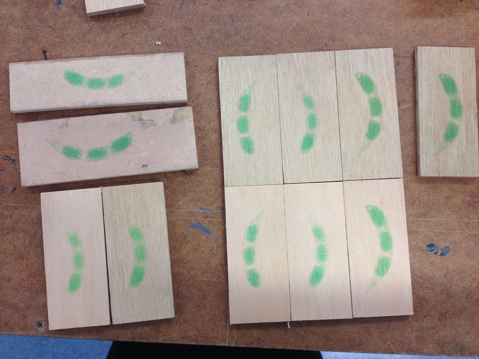
"-use green ink instead of red. I'm interested in the implications of the colour green (Green = go. Green = eco friendly, healthy, etc. Green = toxic.) and of course it is the natural colour of edamame beans. I imagine the resulting effect/message will be 'here is an inviting, seemingly healthy snack; but it's a trap.'"

Some green tests…
The first shade of green was representative of the slightly dark / earthier shade of edamame beans.
Struan suggested I use a more fluro / toxic shade of green to get this message across.


Re-shaping and sharpening all the staples (such a process):


And then trying to decide which colours to present:


While hammering the pieces together, and trying to make sure the contraption worked, I ended up trapping my fingers by accident. God it hurt. But I was really happy that it worked!
For the 'Food?' show, I displayed the red ones. The logic was that conventional red made them invisible. You have to look twice…

The works on subtle display in the corners of Projectspace:


All four traps (one corn, 3 edamame) were set + activated, and a small note warned visitors not to touch them. Luckily no one did. Knowing they are activated is an important part of the work for me - this gives them a tension. They're almost invisible, but dangerous. Or perhaps just cheeky.  

Tuesday, July 14, 2015

WIP: Mouse and rat traps

  • Thinking about Judy's advice to print on other surfaces;
  • bringing back some elements of my (successful?) earlier work 'decisions' (re-imagining familiar objects, analogies, printing on wood);
  • thinking about rodents / animals for testing / pests / genetic modification / ethics, I thought about looking at mouse traps
  • I bought some traps and cut up some wood in a similar size/grain to the original base

Mouse and rat traps conventionally have a logo or image printed on the platform; usually red.
I think the form and size of the corn resembles that of a large rodent… it also sort of looks like an imprint, a blood stain.
Screen printing on wood:


Above: the first wood tests were sized to fit the entire image, although this looked a bit nonsensical with the wire contraption on it. Below: the wood and image cropped to the standard trap size.


A comparison:


Conventionally, these wooden traps are also varnished - I imagine this is so that any blood can be easily cleaned off. Initially I tried applying a layer of GAC 100 and self-levelling clear gel over the print. Unfortunately some of the detail/clarity was lost as a result, presumably be because it darkens the wood grain in between the halftone dots. Still trying to resolve this. The middle print below is varnished in this way, showing the difference:


I tried removing the wire and staples from a trap and re-using them on one of the printed blocks, as I couldn't find any staples of a similar size/colour in any of my local hardware stores. Unfortunately the staples buckled a lot when hammered back into the wood, and it is a challenge to get them positioned just right. In any case it pretty much worked, and here's the slightly wonky result of the first test: 


I also had some smaller mouse traps to experiment with. Corn and soy are two of the most genetically modified crops in the world, so for these I used my x rays of edamame beans. 
The importance of using ink retarder, illustrated:


Below: the middle one is printed directly on raw timber. For the print on the right, I used the GAC/gel medium underneath the print. This was great, until...


…I went to add the metal parts the next day, and it began rubbing off.


I talked to the wood technician Nick about the staples - he does not think I'll find any new ones in a size as small as required for these, they seem to be custom-made for the traps. The only option is transferring the metal contraptions and staples from the bought traps to the printed wood. How to do this? 'It depends how patient you are,' he said.
So now, for each staple, I need to re-shape the metal (which bends out of shape when extracted,) flatten it, and file both ends into sharp points before hammering into the new wood. Such a process - hopefully will be worth it.

The next tests will...
-use sealed timber and less ink retarder with longer drying time; see if this prevents any of the ink from rubbing off.
-use spray varnish over the print + see if this makes any difference in retaining the detail
-use green ink instead of red. I'm interested in the implications of the colour green (Green = go. Green = eco friendly, healthy, etc. Green = toxic.) and of course it is the natural colour of edamame beans. I imagine the resulting effect/message will be 'here is an inviting, seemingly healthy snack; but it's a trap.'

Sunday, July 12, 2015

Wednesday, July 8, 2015

Animal testing?


Documentation, weeks 15-18: Notes for 'Have you ever...'

My ongoing interest in the Seralini Affair.

Work in progress…

The original rat images
The first sketch


The paper that I initially began using (above) was printmaking paper, not watercolour paper. So the colours wouldn't lift back off the page when water was re-applied. When I realised this I had to start again. (You can see the brush strokes are sketchy - I was trying to paint the colours separately in flicks of fur, that I thought would blur together when washed over with water afterwards. Didn't happen.) 
Round two:


The finished outcome

Some of the ideas going on:
Watercolour illustrations = associated with stories for children. I think that anthropomorphic animals in stories send mixed messages to children from a young age, implying some confusing double standards about animal welfare.

The title of this painting connects it to the nursery rhyme: 'Have you ever seen such a thing in your life... as three blind mice', as well as referencing the importance of scepticism towards scientific studies. Have you ever seen such a thing in your life? Really? Have you ever developed a giant tumour from eating popcorn? Know anyone who has? Could people really get cancer from eating GM corn? (Also, perhaps, blindness = metaphor for consumer helplessness, guinea pigs subject to corporate interests, unable to know what we're really consuming, as Seralini puts it 'eating in the dark'.) It touches on the circulation of misinformation regarding health science.

Monsanto's GM corn was not properly tested before being grown for commercial use. The lab rats in their experiments were only observed for 3 months, and even in that time there were some dubious results. They were, however, awfully quick to shoot down Seralini's research, even though the duration of his study was 8 times longer than theirs. The product went straight to market without proper testing. It's as if people - consumers - are the guinea pigs.

The thing that interested me the most about the Seralini affair was my observation that these lab rats, that had been fed GM corn (and RoundUp) and developed giant tumours, actually end up looking a bit like popcorn themselves. They've 'popped' just like the GM corn they are fed. You are what you eat??

The rats are life-sized, surrounded by larger-than-life size popcorn kernels - in this way size itself is also reference to genetic modification (and the idea of making things bigger.) As if the rats themselves are just pieces of popcorn.

Popcorn is a symbol for multiplicity; with that in mind, rats and other rodents are pests that breed and spread like the plague, spreading disease. It makes a connection that I see as fundamentally important part of my project: finding similarities between GMOs and introduced pests. And making the point that they don't belong in NZ.

It's also partially inspired by my part-time job at a cinema, which involves cleaning up a LOT of popcorn all the time. No one would ever eat this popcorn - it looks like it's in the bin (where else would you find rats?) so it references the problem of food waste. As well as the holocaust-esque disposal of sentient beings that is animal testing itself.

Why watercolours?
I've been trying to use watercolours for subjects that are appropriate to its unique traits - e.g. its 'lightness' is ideal for popcorn; 'fluffy' edges are the perfect technique for animals fur. I'm a painter so I appreciate the bleeding of paint across wet paper to create seamless tonal gradients without blending. And that, however deliberate a mark, there is an element of unpredictability, and seeing how pigments react with each other and dry often feels like a science experiment - which is, again, relevant to the subject here.

I wanted to make a watercolour painting that doesn't just float in the middle of the page. Hence a field of popcorn that reaches - and reaches past - the edges of the frame. It could be on the ground, could be a wallpaper, but either way it implies a wider extended pattern, a wider problem. Lots of them.

Documentation week 15-18: Notes and working images for 'Oma, oma, oma'

Making a cast paper sculpture isn't as simple as paper maché. Unfortunately.


Symbolism
-I'm interested in rabbits for many reasons. In NZ especially they represent introduced species gone wrong; they are simultaneously seen as a pest, a food, a pet, a material (rabbit skin glue is often used to size artist paper or prime canvases; rabbit fur and leather in clothing), a test subject, and a common (and often anthropomorphic) character in children's fiction. They also represent sex (playboy) and fertility; have strong connections with the moon - the markings on the moon depict a rabbit shape, hence the Moon Rabbit in Asian folklore, often seen with a mortar and pestle, in Japan it is said to be making 'mochi' rice cakes; in Christianity there is the recurring Three Hares symbolism, 3 rabbits and 3 ears, referencing the Holy Trinity (articles here and here); then there's the Easter bunny, associated with eggs & chocolates, which perhaps even begins to reference commercial/consumer culture childhood obesity… 
There's also slightly autobiographical element to this interest. I've always felt an affinity with rabbits. Until I had braces I always had 'rabbit teeth'. For me they also represent being Pakeha... an (unwanted?) introduced species in Aotearoa, now overrun and ravaging the land… I'm a bit tentative about that metaphor, though, as I don't want my art to be directly about race.
In any case rabbits are clearly very rich in meaning. But this doesn't stop them from being a huge problem here in NZ.


Materials
-I kept my notes and course book from my summer school paper, Maori 101, with vague intentions of recycling the paper somehow this year. I particularly wanted to make a work that referenced my [small amount of] maori heritage or perhaps just the experience of learning the language.

-I found a model rabbit in the toy section of Whitcoulls on Queen St during its closing down sale. This context made me think about the link between rabbits and children's literature...
-Peter Rabbit - Beatrix Potter
-The White Rabbit in Alice in Wonderland
-Watership Down
-There is also connection here with watercolours, so frequently used for children's books' illustrations, and famously used for Durer's 'Young Hare' painting.


Last year, I made a lot of recycled paper, including a couple of thick, moulded 3D works - just simple fruit bowls and pots for plants, made entirely of paper pulp. These rabbits were made using a similar process. However, with the bowls/pots the wet pulp was applied to the outside of the mould, and with the exposure to the air they dried within a few days. Anyway, I wondered if I could do something similar with a more complex shape.

On another note, when I tried to paint with watercolours on my handmade paper, I found that it disintegrated. Ellen Portch explained to me that paper needs a sizing agent and a common way to size artist-grade watercolour paper is with rabbit skin glue. The ball started rolling...

Process

Firstly, the rabbit from Whitcoulls was covered in layers of liquid latex. 


When dry, this was peeled off. The latex mould was filled with paper pulp, which had been sized with rabbit skin glue, pressed into the sides, and left to dry…
For two weeks.
But it was still damp inside the mould. So of course it fell apart when it was peeled off.

Take 2. I thought of cutting it in half to make two 'shells' that could be filled and left open to the air to speed up the drying process. It would just need some sort of support, a way to keep its form. Greg suggested we make a secondary cast like so, and cut it in half:


Except when we cut into it, it cracked into too many pieces to be of use. So we did a traditional plaster cast of the latex rabbit. The latex was cut in half, filled with pulp, most of the liquid pressed out then, then fitted into the plaster cast and left to dry.
And it worked!


The only complication was piecing the two paper 'shells' back together along the seam line, using more wet pulp, and re-drying. This led to noticeable differences in the resulting size and shape of the paper sculptures.

I wanted to paint some watercolours on them to enter them into the Henrietta and Lola Anne Tunbridge scholarship. The eyes were enough. Luckily as the paper was sized with rabbit skin glue I could paint on it without too much bleed. (There was a bit of bleeding, but this is interesting in itself - it speaks to the idea of animal testing, maybe.)

Some photoshopping to decide how the eyes would be painted:


The title...

'Oma, oma, oma' is a reference to the Maori song kiwi kids all learn in primary school: Oma rapeti, oma rapeti, oma, oma, oma. Run rabbit, run rabbit, run, run, run. 
It's a cute song. Also maybe a bit sinister? At least I think so. Run, rabbit run: from the scientists who will use you as a test subject; the farmers and hunters who will shoot you and eat you for dinner; the artists who will use your skin for glue; the designers who will use your skin and pelt for leather bags and fur clothing; even the loving families who will keep you in a cage for the rest of your life. 
So for me this title links the subject to the material (recycled paper from Maori 101) and the 'children's literature' connections, and the triptych, the idea of multiplicity. 

Documentation Weeks 15-18: 'Oma, oma, oma'

Oma, oma, oma
Watercolours on cast recycled paper


Monday, June 8, 2015

Documentation week 14: rats


An a4 watercolour sketch based on these images. I'm fascinated by the whole Seralini controversy and am working on some more images with these rats.
Three blind mice.

Tuesday, April 28, 2015

Lumpy

Fascinated by these images, the study itself, and all the articles and controversy around it.

Daily Mail: Sean Poulter, "Cancer row over GM foods as study says it did THIS to rats... and can cause organ damage and early death in humans "


Jon Entine in Forbes: "Seralini's research is anomalous. Previous peer-reviewed rat feeding studies using the same products (NK603 and Roundup) have not found any negative food safety impacts. The Japanese Department of Environmental Health and Toxicology released a 52-week feeding study of GM soybeans in 2007, finding "no apparent adverse effect in rats." In 2012, a team of scientists at the University of Nottingham School of Biosciences released a review of 12 long-term studies (up to two years) and 12 multi-generational studies (up to 5 generations) of GM foods, concluding there is no evidence of health hazards."[74] Andrew Revkin dubbed it another instance of "single-study syndrome", and contended that the study was in support of an "agenda"

Yes, it could be sensationalism. But if there are so many flaws in this research, as its sceptics are quick to point out, why haven't there been more studies like this?

There's an expression the author uses in this article: Tom Philpott 'Does GMO Corn Really Cause Tumors in Rats?' that I think is really effective. He writes that we are "Eating in the dark."


Between 1992 and 2002—the period over which GMO crops moved rapidly from test plants to farm fields to dinner tables, the USDA spent about $1.8 billion on ag-biotechnology research—of which about 1 percent went to safety testing, a Union of Concerned Scientists analysis shows. Meanwhile, the ag-biotech industry uses its patent power to maintain tight control over who researches what—and dominates the research agenda at America's main ag-research universities. When we eat GMOs, as millions of Americans do every day, we're still eating in the dark. The French study didn't fully illuminate the situation, but it's a start.

Wednesday, April 22, 2015

Michiko Kon

Michiko Kon “Octopus and Melon” (1989)/Courtesy Robert Mann Gallery
Michiko Kon: Still Lifes presents this unique artist's photographs of the impossible objects she has created in her studio. These objects are assembled from fish, flesh, and fowl with a Surrealist sensibility reminiscent of the works of Man Ray and Meret Oppenheim. Michiko Kon's photography deftly makes a permanent record of subjects that only exist temporarily: a garter belt fashioned from fish; a pair of melons covered with octopus tentacles; and a boot made of shrimp, among many other non-delectables. Michiko Kon takes the classic tradition of the still-life photograph and gives it new life through the reanimation of object parts and body parts in new forms. Kon writes: "A fish with legs, a vacuum cleaner turned into an animal, a light bulb turned into a pear, a remote device turned into a living creature...." It is this exchange of the inanimate with the animate that imbues the stillness of her photography with the dynamism of the balance between life and death, the fashionable and the commonplace, being awake and dreaming"
 Source: "Michiko Kon: Still Lifes" Kon, Michiko, Ryū Murakami, and Toshiharu Ito. New York: Aperture, 1997. Print.

Sunday, April 12, 2015


Some kind soul left this DVD on my desk last week. 

Grandin, who has autism, “is Professor of Animal Science at Colorado State University, and is one of the world’s leaders in the design of livestock handling facilities. She has designed livestock facilities throughout the United States and in Canada, Europe, Mexico, Australia, New Zealand and other countries. In North America, almost half of all cattle processing facilities include a center track restrainer system that she designed for meat plants. Her curved chute (race) systems are used worldwide and her writings on the flight zone and other principles of grazing animal behavior have helped many producers to reduce stress during handling.” - Grandin Livestock Handling Systems

Quotes from the film: 

Of course they’re gonna get slaughtered. You think we’d have cattle if people didn’t eat ‘em everyday? They’d just be funny-lookin’ animals in zoos. But we raise them for us. That means we owe them some respect. Nature is cruel, but we don’t have to be. I would'nt want to have my guts ripped out by a lion, I’d much rather die in a slaughterhouse if it was done right.
They’ll be very calm. Nature is cruel but we don’t have to be; we owe them some respect. I touched the first cow that was being stunned. In a few seconds it was going to be just another piece of beef, but in that moment it was still an individual. It was calm… and then it was gone. I became aware of how precious life was. I thought about death and I felt close to God. I don’t want my thoughts to die with me. I want to have done something.

‘Nature is cruel, but we don’t have to be’

 After watching the movie I also enjoyed listening to her Ted Talk about autism and different kinds of thinkers - visual, pattern, and verbal [click here].

You know, the slaughter plants, I’ve worked with them in the '80s; they were absolutely awful. I developed a really simple scoring system for slaughter plants where you just measure outcomes: How many cattle fell down? How many cattle got poked with the prodder? How many cattle are mooing their heads off? And it’s very, very simple. You directly observe a few simple things. It’s worked really well. I get satisfaction out of seeing stuff that makes real change in the real world. We need a lot more of that, and a lot less abstract stuff.

Saturday, April 11, 2015

Chiara Lecca


Chiara Lecca’s sculptures in ‘Art & Ecology Now’
Dutch: “Still life” = stilleven = “life stilled”
Romantic languages: “Dead nature”
I find the human-animal connection full of paradoxes, but the attempt to understand animals is necessary to truly understand ourselves. Indeed it’s this kind of relationship I’m interested in, and man tends to divide it into categories - pets, barnyard animals, animals to be eaten, to be used for clothing or furnishings - and doesn’t consider its complexity.
Brown, Andrew. Art & Ecology Now. London: Thames & Hudson Ltd, 2014.