Showing posts with label drawing. Show all posts

Thursday, August 6, 2015

Documentation week 22: edamame pattern


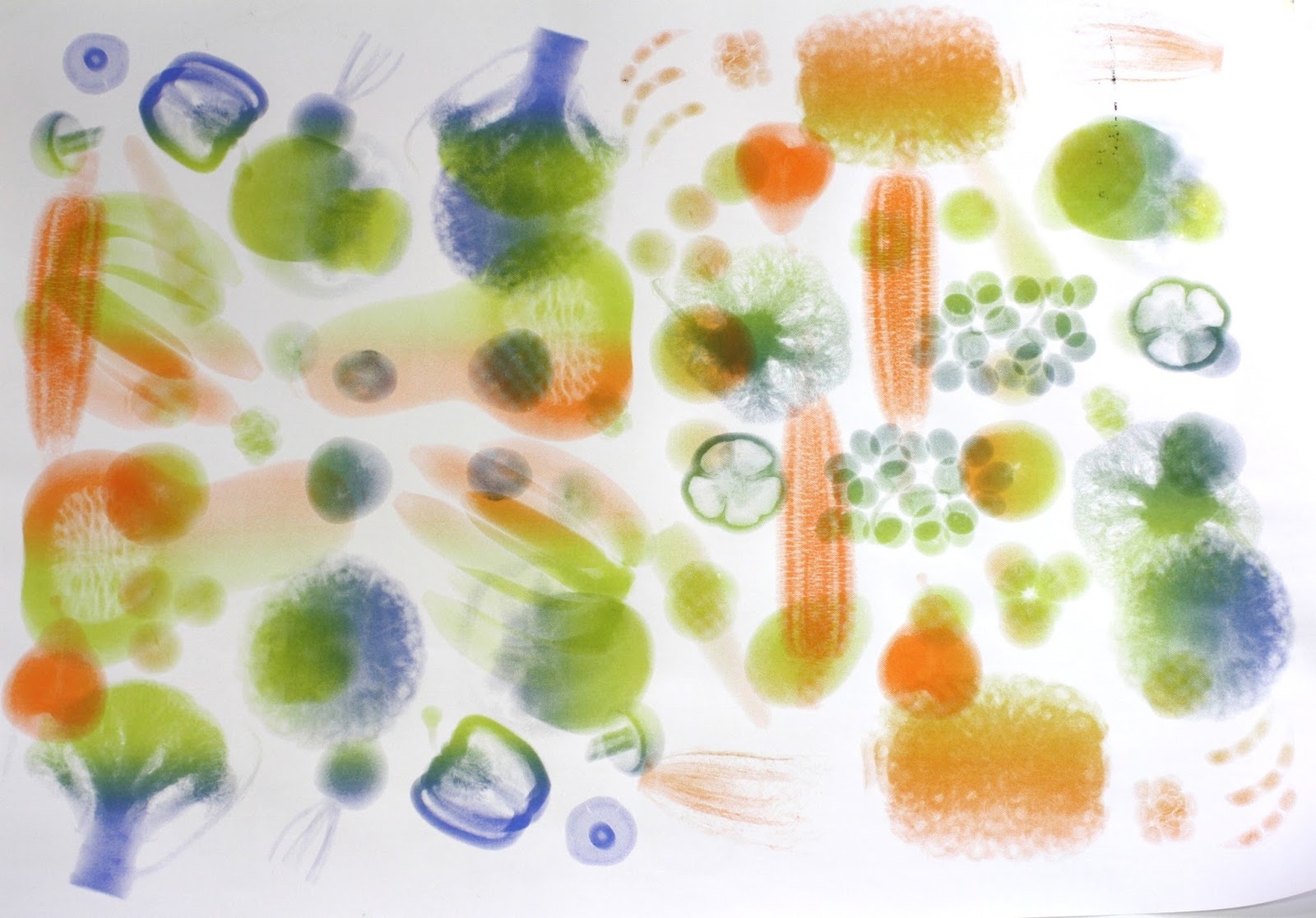
Thinking a lot lately about optics, optical illusions, the 'mechanical eye' vs the human eye, printmaking/filmic 'flatness' and 3-dimensionality - i.e. the difference between an x-ray image and actual 3D object being scanned; again the dichotomy of food choices - soy in particular, as a supposed healthy/sustainable superfood and simultaneously a health nightmare and corrupt industry... anyway this is just a drawing really:


that came as a result of these initial patterns:


"Redamame." Hur hur.

Tuesday, July 7, 2015

Documentation weeks 15-18 'The Colonel'

While painting the large-scale watercolour of popcorn, and going slightly mad in the process, I kept finding what looked like morbid faces in the shapes of the kernels. I got thinking about the implications of this - a bizarre but possibly interesting juxtaposition? - and the possibility of referencing vanities with popcorn. This idea also led me to this antiquated website: Popcornface, and I knew I had to do it.
The image below was made by combining skull-like elements from different kernels. However the result is still not as subtle as I would like it, so I might try again... but probably not. On reflection I feel like using an image of a skull oversimplifies the ideas I'm interested in. Skulls generally imply "X=inevitable death" and I'm much more interested in the complexities, complications, misinformation etc of food systems.


Monday, June 8, 2015

Documentation week 14: rats


An a4 watercolour sketch based on these images. I'm fascinated by the whole Seralini controversy and am working on some more images with these rats.
Three blind mice.

Sunday, May 31, 2015

Documentation up to week 13 (end of May) - test prints

I started with orange layers and the intention to print different coloured layers over the top.


On a couple of these I tested some outlines and shading over the top in green pencil, thinking about the 'green noise' that appears in the customs scan images.


Then, PhD screen printer George had a look at them and asked me, why are you screen printing these? As in, what is there that you can do with THIS particular medium that you can't do with anything else? He showed me some of his current prints, looking at pattern, the disruption of pattern, the effect of layering one image over itself in different arrangements, and the blending of different colours on the one screen. 
He also mentioned the aesthetic of old Adobe packaging design which my images reminded him of, and I can see why.
Anyway, I took his advice on board, using the conventional colours from the airport scan (orange, green and blue) and mixing them on the same screen.
First to create a pattern:


And then beginning to layer them:


Layering ver the original orange prints:


And then layering multi-colour over multi-colour:


At one stage when I had some ink leftover that I didn't want to waste, I "Sarah-Hall-ed" a test with some finger painted squiggles...


Also some tests with the white-on-black:


The first layering print was not successful, as I tried to shift and rotate the images by 180 degrees. There were too many overlaps. (The solution was to use diagonal rotation - you can see the result in the final print I chose to display.)


Thursday, May 14, 2015

Documentation weeks 9-10-11: a test

A test from this week
Thinking about the aesthetic of these images and the idea of different colours indicating different materials. 
Sean Kerr suggested last Thursday that I try to think more about using materials deliberately + consciously, selecting materials that are cohesive with the ideas being presented. The week before Jon Bywater reminded me that this is a material investigation, not just a conceptual one. This small sketch (about 20cm high) is a test in response to this advice.
Ellen Porch told me in 2nd year painting that when working with multiple types of paint media you can layer acrylic over watercolours, and oils over acrylic, but they won't work in any other order. (the paper itself is the binder for watercolours, which wouldn't be able to go on top of anything else; oils would rot the paper without another layer in between, so the acrylic, which is non-organic and won't rot the paper, works as a ground.) So using my X-rays as reference I layered some vegetables up, starting with watercolours (in orange - the colour which signifies natural and organic materials in customs x-rays) then acrylic (green - which signifies plastic) and oil (blue - signifies heavy/dense materials)


The work in progress, before acrylic + oil layers:


Aubrey Beardsley

Looking at Aubrey Beardsley, as suggested by Lisa and Judy.
Don't know how I hadn't heard of him before. Figurative, decorative, Japonism, Art Nouveau, fine illustration, printmaking, narrative... so many things I love. I'm obsessed. Much more research to come on this artist.


Tuesday, April 28, 2015

A cartoon


Source unknown.

Monday, April 27, 2015

Documentation Weeks 7-8

A few dumb drawings...

Ellen explained to me how to size paper - now I can paint on my handmade paper without it disintegrating, yay!


 Thinking about text art. Dirt and honey | dirty and hungry | diet and money
Also thinking about colour overlapping, the 'screen printing aesthetic' of mis-registration and CYMK colour, and again the idea of printmaking using paint...?


Colour tests for a larger piece. 'Waterre' is a mix of my languages. Wa, Japanese for balance/harmony/unity, or Maori for time/season. Water, english. Terre, french for Earth or dirt.

Whole foods | Wholesome | Some foods?

Documentation: Weeks 7-8 Stamps


The linocuts used for this piece, which I this week made into actual stamps.

Saturday, April 18, 2015

Effluence


Documentation, weeks 5-6 - just a drawing that I forgot to post last week.

Sunday, April 12, 2015


Documentation, weeks 5-6:

A test, trying to combine painting with screen printing. I colour-blocked the original photo [which can be seen here] by tracing over specific colour areas on a plastic sheet, which were then projected one at a time onto the canvas with an OHP projector, and I would directly paint over the shadows.

This colour-block layering resembles the process of screen printing - the slight differences in the position of the easel, transparency, and projector, resulted in some mis-registration. I’m happy with the outcome but I’d like to try it again with more transparent paint so the layering process is more evident, perhaps with watercolours.

This is an image of the braided river in the Canterbury Plains. Since the Tuakana trip in 2014 I’ve been thinking a lot about Fonterra’s policy of only buying milk from dairy farms where the cows are fenced off away from the river ways, a move which is imperative to the health of the rivers and the species that live in them, but which is ignored by many farmers. And no such guidelines are enforced with livestock cattle. Hence the problem of polluted rivers…

Saturday, April 11, 2015


Documentation: weeks 5-6

Final painting/sketch in this series: rabbit & possum, stoat & rat & cat.

‘The Whangarei Kiwi Sanctuary Study from 2000-2005 showed dogs were responsible for 42 % of kiwi deaths including 69 % of adult kiwi deaths.’

Department of Conservation website: New Zealand animal pests and threats

Animal or the food


Documentation: Weeks 5-6
The Animal or the Food? Pencil drawing. A2.
Later version of this idea.
Details:


Tuesday, March 31, 2015


Documentation: Weeks 3-4

Pick me. Watercolours on paper, A2.

Thinking about organics, pesticides+insecticides, food miles. But mostly about consumer choices. I’ve never actually had any bad quality organic fruit + veg, and it’s not really that much more expensive, so this is just a caricature of our assumptions regarding the quality+price of organic + local produce. The bottom line is that it’s tempting to go for the cheapest option, especially when it’s bigger and prettier.

BUT.

“The average conventionally grown apple has more pesticide residue on it than any other fruit or vegetable. According to the Environmental Working Group‘s analysis of USDA data, pesticides showed up on 98 percent of the more than 700 apple samples tested (yes, they were washed).” (source: Forbes

Also thinking about Billy Apple since his art is everywhere in Auckland right now. And the apple as a symbol: apple/mac products, Snow White, Eve and the snake and the garden of Eden.

Sunday, March 29, 2015


Documentation: Weeks 3-4

My first attempt at an aquatint etching (using powdered resin to create tonal gradation & a grainy watercolour texture)

A third year student’s comment: “Come on… Surely coffee isn’t that toxic!”

I laughed. That’s not what I was trying to say, but I love hearing surprising new readings of my work. 

My thought process for this little drawing was that each time we buy a takeaway cup of coffee, the milk comes from an industry that is responsible for most of our carbon emissions (“50% of New Zealand’s greenhouse gas emissions are attributable tomethane and nitrous oxide, predominantly from agriculture” - A dairy farm is not greenhouse gas neutral (carboNZero media release) PDF) and dairy giant Fonterra is powered mostly by coal (55% - Fonterra Energy website) which “creates more emissions per unit of energy produced when compared with oil or gas” (this article)

Not only that but takeaway packaging is another huge problem in terms of waste and emissions: “According to a study conducted by Starbucks and the Alliance for the Environmental Innovation (April 2000), each paper cup manufactured is responsible for 0.24 lbs of CO2 emissions.” (That’s 108 grams. If you have a coffee five times a week, that’s 28 KILOGRAMS of carbon emissions in a year. And that doesn’t include the plastic lid. Also, if the research was funded by Starbucks I feel that a lot of the stats might well have been rounded down in other ways, too.)

So whether coffee is toxic is debatable, but our takeaway coffee habit is just another way we individual consumers mindlessly contribute our small part - and in some cases on a daily basis - towards our country’s embarrassingly high carbon emissions.

Let the record show that I never never use takeaway containers. I also never eat or drink while driving or walking. It’s something I picked up while living in Japan, where it’s culturally considered rude to eat while in motion: if it’s time to eat or drink, you find somewhere to sit down. Simple as that. So, if I don’t have time to sit in the cafe and drink my coffee from a proper cup, I obviously won’t have time to enjoy it properly and therefore won’t bother buying one. Not only are they an environmental disaster, I think that the need to consume on-the-go food and beverages is an indication of what is fundamentally a lifestyle problem, and we all need to slow down and consume with more mindfulness.


Documentation: Weeks 3-4

More watercolour drawings to accompany these.

I’ll happily accept that cats are a threat to native NZ wildlife, a pest like any other. I don’t like cats at all. In saying that, I’m a dog lover so it really saddened me to read that ‘The Whangarei Kiwi Sanctuary Study from 2000-2005 showed dogs were responsible for 42 % of kiwi deaths including 69 % of adult kiwi deaths.’ (Department of Conservation website: New Zealand animal pests and threats)

It seems there will be (at least) one more painting in this series.

Saturday, March 21, 2015


An incredible old book of botanical illustrations, used as a reference for lucerne etchings 1 & 2