Showing posts with label materials. Show all posts

Saturday, September 5, 2015

Documentation: in preparation for visiting artist crit

Judy suggested in the middle of the year that I try printing on other surfaces, and that I try to incorporate movement. The idea of a conveyor belt came up in that discussion.

How cool that would be - to print onto a conveyor belt. So I had this grandoise idea, but no idea if, or how, it would ever come to fruition...
Then, the stars aligned. Someone just happened to be selling a supermarket conveyor belt on Trademe. It was cheaper than the other ones listed, some of which were industrial, thousands of dollars, but this one was still quite an investment. I went for it. And I feel really excited about the installation I have in mind for it.

As a test for the visiting crit, I wanted to hang it on the wall, but this poses some problems as it's 50kgs. Hanging it sideways - horizontal - was the original plan. When I emailed the manufacturers (all conveyor belts in NZ are custom made, and the ones I bought have handy ID numbers and it turns out they are still under warranty - awesome) they pointed out that, thanks to the inconvenient force of gravity, if hung sideways the rubber belt would slip down and possibly get damaged. So, vertical it was.
After a lot of discussion with Pete about how the wall mount could be achieved, I set to work. I measured it all up; went to the north shore to buy some steel; learned to cut, drill, bend and weld; and with these newly acquired skills, made a bracket to connect to the back of the conveyor belt and hook over the top of the wall...

Bend it like Beckham

I also had to find a reflector that would work with the sensors that attach to the motor. The manufacturers told me to buy a certain kind, because the maximum range of the sensors depends on which kind of reflector you use. I emailed a few electronic shops and, after receiving a few curt 'no's, finally managed to track one place that had the right kind.

This can be 3 metres max away from the sensor

And the other advice in their email was super exciting. I'd asked whether the electric circuit could be customised so that when switched on the conveyors could be displayed rolling continuously, and whether the speed could be adjusted. They informed me that this would be a terrible idea because the motor would overheat. The way the sensor works, though, is that it only triggers the rotating motion when the reflection is disrupted. Then, it will rotate for about 10 seconds, or until it is disrupted again.
This is because in a supermarket, or other shop, you want the movement of the conveyor to stop as soon as the customer's goods reach the edge by the cashier. So that's where the sensor is placed. When something reaches that point, the movement is halted. When that object is removed, the conveyor moves again... and the next item comes along, breaking the signal, pausing the movement again.

Meaning that the conveyors will be stationary until someone comes close enough, breaking the signal. Just walking past the work will set off the rotating motion. And it will stop moving if you stop and stand in front of it.
A work that is activated by the viewer!! I'm so excited about this.

Sunday, August 23, 2015

Boxes

After the ‘food pyramid’, another arrangement for the found boxes - playing with these in studio is like playing with supersized lego blocks, such fun


I thought this might feel like a dingy alleyway behind a supermarket, but Holly commented that she felt really comfortable standing in the doorway?? I think there is something appealing about the colours, and familiar, or nostalgic. There's the idea of abundance.

Printing at V3 (Documentation - mid August)

I was going to screen print these images onto the petri dishes, or perhaps onto adhesive vinyl to stick onto them, but with the CMYK process this would take all week at least, and printing on other surfaces is so hit-and-miss… not to mention the images are far too detailed for halftone.
I’d also been wondering what to do with my boxes, because as I mentioned the idea of a ‘readymade’ is not something I’m comfortable with - it’s too far separated from my own practice, I am too set in my ideas regarding image authenticity, and too interested in translation through printmaking, etc. The other plan was to hand paint or screen print the box designs onto another surface, but once again, that’s a time consuming commitment.
Photographing the boxes results in a lot of lens distortion and an image that was not quite as high-definition as I would like. Instead I scanned every box and photoshopped them together (as discussed in this post.) To save myself a lot of time in the printmaking room, I thought I’d try to get two birds with one stone.
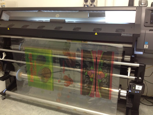
So I went out to my uncle’s company called V3, and used their sign-printing shop to print these images onto clear adhesive. (Luckily, because I used to work at V3 for a summer job, and my uncle owes me for a lot of babysitting, they let me do the printing for free. I imagine it would have been a few hundred dollars otherwise!) They also taught me how to use their new printing machine and the computer programs specific to it. The printer has a vacuum table inside it which needs to be adjusted according to the weight of the vinyl, and the ink is automatically heat-set after it prints. A very cool process to learn about and play around with. I'm so glad I got to have a hand in the technical side of things with this printing process - MUCH more valuable and interesting than just sending them off to a printer and seeing only the finished product!
We printed on a couple of different surfaces: optic clear adhesive, which is crystal clear and the adhesive is super strong, almost permanent; and a normal clear adhesive which is cloudier but cheaper and removable.
The super transparent, super high quality vinyl was perfect for the fruit images


In studio:

But we ran out of this type of vinyl while printing the boxes, which led to using the lower quality one for a few of them.


In studio - during my cross-group crit somebody said these look like a spread of alternative flag designs, haha! I quite like the prevalence of NZ symbols, like the silver fern in the pepper.


I also printed a few of my X-rays in different colours - images to follow.


Friday, August 21, 2015

Documentation: Corn on acrylic

These were test prints on scrap acrylic. They caught the supervisor's eye in my cross-group crit a couple of weeks ago, and were passed around, with some surprisingly positive feedback.


In terms of colour, I think the print above is the most successful: opaque white on translucent black. By comparison the yellow ink in the other two gets lost, but there is enough contrast in the one above to clearly see the image. And there is something noticeably medical about the x-ray on dark tinted acrylic. 


The above is printed on clear acrylic. The sheet was left over from when I did laser-cut honeycomb patterns and prints at the start of the year. At the time this attempt was a hot mess. We quickly realised with this one that it was the wrong type of plastic, hence the melting and burned effect and incompletion. I held onto the remnants, though, in case it might come in handy later in the year - and it did!
I'd been wanting to make a work which draws a comparison between a honeycomb pattern (yellow, geometric, speaks to contemporary discussion about bees - decline in bee population, possible causes eg. pesticides and destruction of natural habitats) and a corn cob (also yellow, geometric, small kernels - the exact same size as a beehive hexagon, speaks to consumerism, modern farming, GMOs, pesticides, etc...) - the two patterns are an aesthetic + conceptual match made in heaven.
The smoky texture also speaks to things like smoking beehives to calm the bees; fire - a sense of danger; the fact that it's just a segment of the cob makes it looks like a bite has been taken out of it, a possible analogy for 'consuming' or destroying the land via monocrops...

If I could do it again it would be printed in black, not yellow.

Friday, August 14, 2015

Documentation: boxes, continued

I wanted to document the variety of images on the produce boxes, but photographs weren't getting the  image quality I was after. So I dragged all the boxes up to the computer lab and scanned them (in 2-4 parts for the larger boxes...)


then photoshopping them back together, and tidying up the backgrounds etc.
Some of the results:


Thursday, August 6, 2015

Documentation week 22: petri dishes


 Displayed on the 'conversation table' as a last minute edition to our exhibition:


-thinking about what x-raying really involves - the idea of seeing through something, seeing all of it - and the reasons for doing so (scientific investigation, health, usually searching for something damaged or broken)
-food as the object of investigation
-dissection
-lengthening - mass production, GMO, the idea of altering something to make it go further
-the petri dishes are like a stack of plates - each layer could be served to someone, like a sample dish at the supermarket - the plastic reinforces this - I suppose this is McLuhan-style observation/connection between the fields of science and food

This work got a few great reactions. Many people thought it was a corn cob, from the shape / length and the green colour.

Unfortunately it went quite rotten & smelly after a week on display:


-next step: I might scan/print the fruit segments to recreate this effect but in a non-perishable art medium - the idea of reproduction, synthetic food production, cloning...
-could create hybrid forms by splicing and combining numerous objects...

Friday, July 31, 2015

Ben Young: Aussie glass artist

Ben Young makes sculptures out of layers of glass; he says in a video interview that he doesn't use a computer, the entire process is executed by hand. I'm curious to know how he measures and cuts the curved edges so precisely.


Sunday, July 12, 2015

Wednesday, July 8, 2015

Documentation, weeks 15-18: Notes for 'Have you ever...'

My ongoing interest in the Seralini Affair.

Work in progress…

The original rat images
The first sketch


The paper that I initially began using (above) was printmaking paper, not watercolour paper. So the colours wouldn't lift back off the page when water was re-applied. When I realised this I had to start again. (You can see the brush strokes are sketchy - I was trying to paint the colours separately in flicks of fur, that I thought would blur together when washed over with water afterwards. Didn't happen.) 
Round two:


The finished outcome

Some of the ideas going on:
Watercolour illustrations = associated with stories for children. I think that anthropomorphic animals in stories send mixed messages to children from a young age, implying some confusing double standards about animal welfare.

The title of this painting connects it to the nursery rhyme: 'Have you ever seen such a thing in your life... as three blind mice', as well as referencing the importance of scepticism towards scientific studies. Have you ever seen such a thing in your life? Really? Have you ever developed a giant tumour from eating popcorn? Know anyone who has? Could people really get cancer from eating GM corn? (Also, perhaps, blindness = metaphor for consumer helplessness, guinea pigs subject to corporate interests, unable to know what we're really consuming, as Seralini puts it 'eating in the dark'.) It touches on the circulation of misinformation regarding health science.

Monsanto's GM corn was not properly tested before being grown for commercial use. The lab rats in their experiments were only observed for 3 months, and even in that time there were some dubious results. They were, however, awfully quick to shoot down Seralini's research, even though the duration of his study was 8 times longer than theirs. The product went straight to market without proper testing. It's as if people - consumers - are the guinea pigs.

The thing that interested me the most about the Seralini affair was my observation that these lab rats, that had been fed GM corn (and RoundUp) and developed giant tumours, actually end up looking a bit like popcorn themselves. They've 'popped' just like the GM corn they are fed. You are what you eat??

The rats are life-sized, surrounded by larger-than-life size popcorn kernels - in this way size itself is also reference to genetic modification (and the idea of making things bigger.) As if the rats themselves are just pieces of popcorn.

Popcorn is a symbol for multiplicity; with that in mind, rats and other rodents are pests that breed and spread like the plague, spreading disease. It makes a connection that I see as fundamentally important part of my project: finding similarities between GMOs and introduced pests. And making the point that they don't belong in NZ.

It's also partially inspired by my part-time job at a cinema, which involves cleaning up a LOT of popcorn all the time. No one would ever eat this popcorn - it looks like it's in the bin (where else would you find rats?) so it references the problem of food waste. As well as the holocaust-esque disposal of sentient beings that is animal testing itself.

Why watercolours?
I've been trying to use watercolours for subjects that are appropriate to its unique traits - e.g. its 'lightness' is ideal for popcorn; 'fluffy' edges are the perfect technique for animals fur. I'm a painter so I appreciate the bleeding of paint across wet paper to create seamless tonal gradients without blending. And that, however deliberate a mark, there is an element of unpredictability, and seeing how pigments react with each other and dry often feels like a science experiment - which is, again, relevant to the subject here.

I wanted to make a watercolour painting that doesn't just float in the middle of the page. Hence a field of popcorn that reaches - and reaches past - the edges of the frame. It could be on the ground, could be a wallpaper, but either way it implies a wider extended pattern, a wider problem. Lots of them.

Documentation week 15-18: Notes and working images for 'Oma, oma, oma'

Making a cast paper sculpture isn't as simple as paper maché. Unfortunately.


Symbolism
-I'm interested in rabbits for many reasons. In NZ especially they represent introduced species gone wrong; they are simultaneously seen as a pest, a food, a pet, a material (rabbit skin glue is often used to size artist paper or prime canvases; rabbit fur and leather in clothing), a test subject, and a common (and often anthropomorphic) character in children's fiction. They also represent sex (playboy) and fertility; have strong connections with the moon - the markings on the moon depict a rabbit shape, hence the Moon Rabbit in Asian folklore, often seen with a mortar and pestle, in Japan it is said to be making 'mochi' rice cakes; in Christianity there is the recurring Three Hares symbolism, 3 rabbits and 3 ears, referencing the Holy Trinity (articles here and here); then there's the Easter bunny, associated with eggs & chocolates, which perhaps even begins to reference commercial/consumer culture childhood obesity… 
There's also slightly autobiographical element to this interest. I've always felt an affinity with rabbits. Until I had braces I always had 'rabbit teeth'. For me they also represent being Pakeha... an (unwanted?) introduced species in Aotearoa, now overrun and ravaging the land… I'm a bit tentative about that metaphor, though, as I don't want my art to be directly about race.
In any case rabbits are clearly very rich in meaning. But this doesn't stop them from being a huge problem here in NZ.


Materials
-I kept my notes and course book from my summer school paper, Maori 101, with vague intentions of recycling the paper somehow this year. I particularly wanted to make a work that referenced my [small amount of] maori heritage or perhaps just the experience of learning the language.

-I found a model rabbit in the toy section of Whitcoulls on Queen St during its closing down sale. This context made me think about the link between rabbits and children's literature...
-Peter Rabbit - Beatrix Potter
-The White Rabbit in Alice in Wonderland
-Watership Down
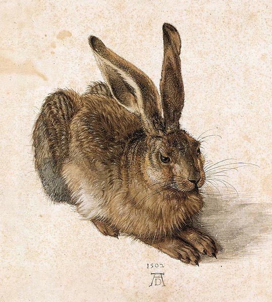
-There is also connection here with watercolours, so frequently used for children's books' illustrations, and famously used for Durer's 'Young Hare' painting.


Last year, I made a lot of recycled paper, including a couple of thick, moulded 3D works - just simple fruit bowls and pots for plants, made entirely of paper pulp. These rabbits were made using a similar process. However, with the bowls/pots the wet pulp was applied to the outside of the mould, and with the exposure to the air they dried within a few days. Anyway, I wondered if I could do something similar with a more complex shape.

On another note, when I tried to paint with watercolours on my handmade paper, I found that it disintegrated. Ellen Portch explained to me that paper needs a sizing agent and a common way to size artist-grade watercolour paper is with rabbit skin glue. The ball started rolling...

Process

Firstly, the rabbit from Whitcoulls was covered in layers of liquid latex. 


When dry, this was peeled off. The latex mould was filled with paper pulp, which had been sized with rabbit skin glue, pressed into the sides, and left to dry…
For two weeks.
But it was still damp inside the mould. So of course it fell apart when it was peeled off.

Take 2. I thought of cutting it in half to make two 'shells' that could be filled and left open to the air to speed up the drying process. It would just need some sort of support, a way to keep its form. Greg suggested we make a secondary cast like so, and cut it in half:


Except when we cut into it, it cracked into too many pieces to be of use. So we did a traditional plaster cast of the latex rabbit. The latex was cut in half, filled with pulp, most of the liquid pressed out then, then fitted into the plaster cast and left to dry.
And it worked!


The only complication was piecing the two paper 'shells' back together along the seam line, using more wet pulp, and re-drying. This led to noticeable differences in the resulting size and shape of the paper sculptures.

I wanted to paint some watercolours on them to enter them into the Henrietta and Lola Anne Tunbridge scholarship. The eyes were enough. Luckily as the paper was sized with rabbit skin glue I could paint on it without too much bleed. (There was a bit of bleeding, but this is interesting in itself - it speaks to the idea of animal testing, maybe.)

Some photoshopping to decide how the eyes would be painted:


The title...

'Oma, oma, oma' is a reference to the Maori song kiwi kids all learn in primary school: Oma rapeti, oma rapeti, oma, oma, oma. Run rabbit, run rabbit, run, run, run. 
It's a cute song. Also maybe a bit sinister? At least I think so. Run, rabbit run: from the scientists who will use you as a test subject; the farmers and hunters who will shoot you and eat you for dinner; the artists who will use your skin for glue; the designers who will use your skin and pelt for leather bags and fur clothing; even the loving families who will keep you in a cage for the rest of your life. 
So for me this title links the subject to the material (recycled paper from Maori 101) and the 'children's literature' connections, and the triptych, the idea of multiplicity.