Showing posts with label patterns. Show all posts

Friday, August 21, 2015

Documentation: Corn on acrylic

These were test prints on scrap acrylic. They caught the supervisor's eye in my cross-group crit a couple of weeks ago, and were passed around, with some surprisingly positive feedback.


In terms of colour, I think the print above is the most successful: opaque white on translucent black. By comparison the yellow ink in the other two gets lost, but there is enough contrast in the one above to clearly see the image. And there is something noticeably medical about the x-ray on dark tinted acrylic. 


The above is printed on clear acrylic. The sheet was left over from when I did laser-cut honeycomb patterns and prints at the start of the year. At the time this attempt was a hot mess. We quickly realised with this one that it was the wrong type of plastic, hence the melting and burned effect and incompletion. I held onto the remnants, though, in case it might come in handy later in the year - and it did!
I'd been wanting to make a work which draws a comparison between a honeycomb pattern (yellow, geometric, speaks to contemporary discussion about bees - decline in bee population, possible causes eg. pesticides and destruction of natural habitats) and a corn cob (also yellow, geometric, small kernels - the exact same size as a beehive hexagon, speaks to consumerism, modern farming, GMOs, pesticides, etc...) - the two patterns are an aesthetic + conceptual match made in heaven.
The smoky texture also speaks to things like smoking beehives to calm the bees; fire - a sense of danger; the fact that it's just a segment of the cob makes it looks like a bite has been taken out of it, a possible analogy for 'consuming' or destroying the land via monocrops...

If I could do it again it would be printed in black, not yellow.

Saturday, June 13, 2015

Jacqueline Fahey

Paintings by Jacqueline Fayey. I became interested in Fahey's work after being mesmerised by an excerpt of her second memoirs, Before I Forget, during her interview on national radio a couple of weeks ago.


These are the very paintings I'd make if I could. Fahey is everything I aspire to.

a few thoughts…
-appearance of 'flattening'
-collage effect - seemingly jumbled objects - movement? through composition?
-colour clusters and pattern fields - patchwork effect
-narrative - domestic scenes

Sunday, May 31, 2015

Documentation up to week 13 (end of May) - grocery bags

As designed and discussed in this post
These were printed on cotton and sewed into grocery bags (fiddly and time consuming, yes, but I thought it would be easier to print on plain fabric than trying to screen print onto ready-made bags).
These will be given as gifts to the kind women at Mercy Radiology and Auckland customs who let me come and use their x ray machines. I may hold onto them for a while longer first, to possibly display them in the food-themed group exhibition Jane and I proposed for next semester. 


Monday, March 16, 2015

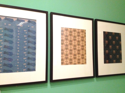
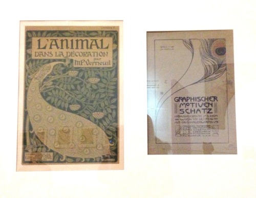
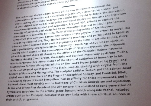
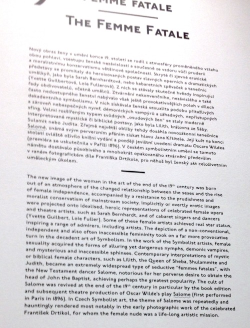
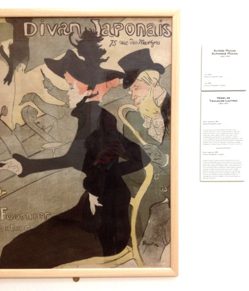
Various images from the Exhibition of Art Nouveau

Including prints, posters, pastedowns/endpages, patterns and exhibition information
Museum of Decorative Arts, Prague


[Note: above images are from my gap year in 2013, which I spent trawling the art galleries of Europe and taking lots of photos of artworks that I liked. Over the past summer I have organised+compiled all of these. By doing so and uploading them here I’m hoping to find connections and identify common elements, creating a record of the things I felt drawn to and inspired by.]