Showing posts with label horticulture. Show all posts

Friday, August 21, 2015

Documentation: Corn on acrylic

These were test prints on scrap acrylic. They caught the supervisor's eye in my cross-group crit a couple of weeks ago, and were passed around, with some surprisingly positive feedback.


In terms of colour, I think the print above is the most successful: opaque white on translucent black. By comparison the yellow ink in the other two gets lost, but there is enough contrast in the one above to clearly see the image. And there is something noticeably medical about the x-ray on dark tinted acrylic. 


The above is printed on clear acrylic. The sheet was left over from when I did laser-cut honeycomb patterns and prints at the start of the year. At the time this attempt was a hot mess. We quickly realised with this one that it was the wrong type of plastic, hence the melting and burned effect and incompletion. I held onto the remnants, though, in case it might come in handy later in the year - and it did!
I'd been wanting to make a work which draws a comparison between a honeycomb pattern (yellow, geometric, speaks to contemporary discussion about bees - decline in bee population, possible causes eg. pesticides and destruction of natural habitats) and a corn cob (also yellow, geometric, small kernels - the exact same size as a beehive hexagon, speaks to consumerism, modern farming, GMOs, pesticides, etc...) - the two patterns are an aesthetic + conceptual match made in heaven.
The smoky texture also speaks to things like smoking beehives to calm the bees; fire - a sense of danger; the fact that it's just a segment of the cob makes it looks like a bite has been taken out of it, a possible analogy for 'consuming' or destroying the land via monocrops...

If I could do it again it would be printed in black, not yellow.

Friday, August 14, 2015

Documentation: boxes, continued

I wanted to document the variety of images on the produce boxes, but photographs weren't getting the  image quality I was after. So I dragged all the boxes up to the computer lab and scanned them (in 2-4 parts for the larger boxes...)


then photoshopping them back together, and tidying up the backgrounds etc.
Some of the results:


Documentation week 22: petri dishes, second incarnation

Following from my kiwifruit sculpture, I did a few more petri dish works, using other fruits/veggies and techniques...

A banana.
As they were cut into 5mm segments, the fruits/veggies each became 3 times its height when separated and stacked. I loved the ridiculousness of it.


I then realised that from the one banana, I could make 2 or 3 smaller ones simply by dividing the layers evenly. Above is one banana turned into two; every second dish separated.

The next experiment was removing the banana from its peel on each layer, resulting in one banana-flesh and one empty peel retaining its shape.


I did the same with a kiwifruit and tomato, taking only each 2nd/3rd segment to 'compress' the form back into a life-size height.
Then I tried stacking them all on top of each other. They were deliberately chosen for their colours - thinking here about 'traffic light' food labelling.


Saturday, August 8, 2015

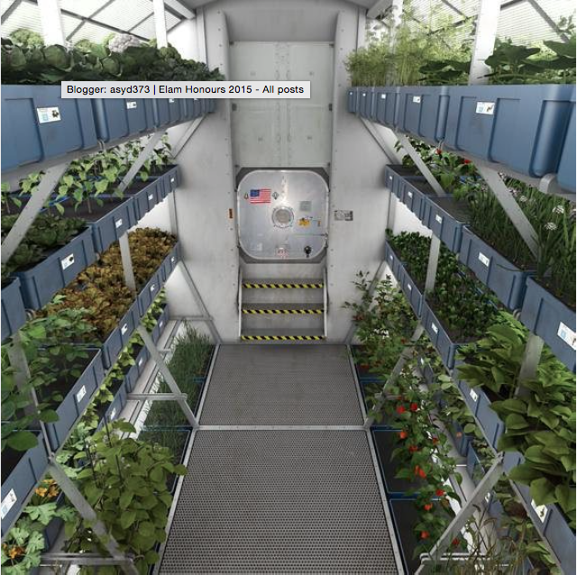
VEGGIES IN SPACE


Fresh food grown in the microgravity environment of space officially is on the menu for the first time for NASA astronauts on the International Space Station. Expedition 44 crew members, including NASA's one-year astronaut Scott Kelly, are ready to sample the fruits of their labor after harvesting a crop of "Outredgeous" red romaine lettuce Monday, Aug. 10, from the Veggie plant growth system on the nation’s orbiting laboratory.

From this article

Here is the official page about the 'Veggie' mission on NASA's website 

Red lettuce...


Friday, July 31, 2015

A look at selective breeding

Vox article: A Renaissance painting reveals how breeding changed watermelons


James Nienhuis, a horticulture professor at the University of Wisconsin, uses the Stanchi painting in his classes to teach about the history of crop breeding.
"It's fun to go to art museums and see the still-life pictures, and see what our vegetables looked like 500 years ago," he told me. In many cases, it's our only chance to peer into the past, since we can't preserve vegetables for hundreds of years.

Which led me to this article: Here's what 9,000 years of breeding has done to corn, peaches, and other crops

Amazing infographics…


Thursday, July 16, 2015

Artist Klaus Pichler Showcases Rotting Food In Still Life Series


The project, titled "One Third," takes its name from the 1.3 billion tons of food -- roughly a third of the total world supply -- that regularly goes to waste according to a 2011 study by the United Nations. At the same time, 925 million people worldwide live with the threat of starvation.
The images, beautifully composed but often stomach turning, are accompanied by statistics regarding the food's origin, time of harvest, means of transportation, distance traveled and its carbon footprint.
In a statement accompanying the work, Pichler writes about the disparity in food waste between industrialized and non-industrialized nations.


Artist website here - "One Third" project -  "Skeletons in the closet"

Tuesday, July 7, 2015

Monday, July 6, 2015

Documentation: Weeks 15-18 'Bio In Security'


Bio In Security
Watercolour on paper, 55x73cm

Notes from my application for the Henrietta and Lola Ann Tunbridge watercolour scholarship:

'Delicate' and 'detailed' - not necessarily qualities which are encouraged in a contemporary art environment, but they certainly explain why watercolours are my go-to medium. ... I enjoy detailed line-work, and this is a medium that creates its own fine outlines, from pigments pooling at the edge of a painted area
My current project is primarily about food systems, and these works address topics that interest me such as the Queensland fruit fly, the Seralini affair, and the ongoing GMO debate. I have been drawing links between the materiality of food and art - e.g. gum arabic, used as the binder in watercolour paints, is also used widely in processed food.
As paper itself also essentially acts as a binder, watercolours are notoriously unforgiving (unlike acrylic and oil paint, you can't scrub a layer away and paint over it,) but this is also what makes them appear so luminous, like a digital screen. Such translucency lends itself to to the process of layering, and aligns with my interest in X-rays. It also refers to the 'transparency' of certain systems - food labelling, medical science, surveillance, biosecurity. 

It's as if these x-rays were made to be translated into a watercolour painting. See also my small multi-media piece, colour-coding the layers to different paint media (watercolours, acrylic and oils)

Sunday, May 31, 2015

Documentation up to week 13 (end of May) - test prints

I started with orange layers and the intention to print different coloured layers over the top.


On a couple of these I tested some outlines and shading over the top in green pencil, thinking about the 'green noise' that appears in the customs scan images.


Then, PhD screen printer George had a look at them and asked me, why are you screen printing these? As in, what is there that you can do with THIS particular medium that you can't do with anything else? He showed me some of his current prints, looking at pattern, the disruption of pattern, the effect of layering one image over itself in different arrangements, and the blending of different colours on the one screen. 
He also mentioned the aesthetic of old Adobe packaging design which my images reminded him of, and I can see why.
Anyway, I took his advice on board, using the conventional colours from the airport scan (orange, green and blue) and mixing them on the same screen.
First to create a pattern:


And then beginning to layer them:


Layering ver the original orange prints:


And then layering multi-colour over multi-colour:


At one stage when I had some ink leftover that I didn't want to waste, I "Sarah-Hall-ed" a test with some finger painted squiggles...


Also some tests with the white-on-black:


The first layering print was not successful, as I tried to shift and rotate the images by 180 degrees. There were too many overlaps. (The solution was to use diagonal rotation - you can see the result in the final print I chose to display.)