In case the above images don't animate on your device (for instance they work on the Elam computers, but not on my own laptop), here are video files:
Showing posts with label geneticmodification. Show all posts
Friday, August 21, 2015
Animation tests
In case the above images don't animate on your device (for instance they work on the Elam computers, but not on my own laptop), here are video files:
Friday, August 14, 2015
Documentation week 22: petri dishes, second incarnation
Following from my kiwifruit sculpture, I did a few more petri dish works, using other fruits/veggies and techniques...
A banana.
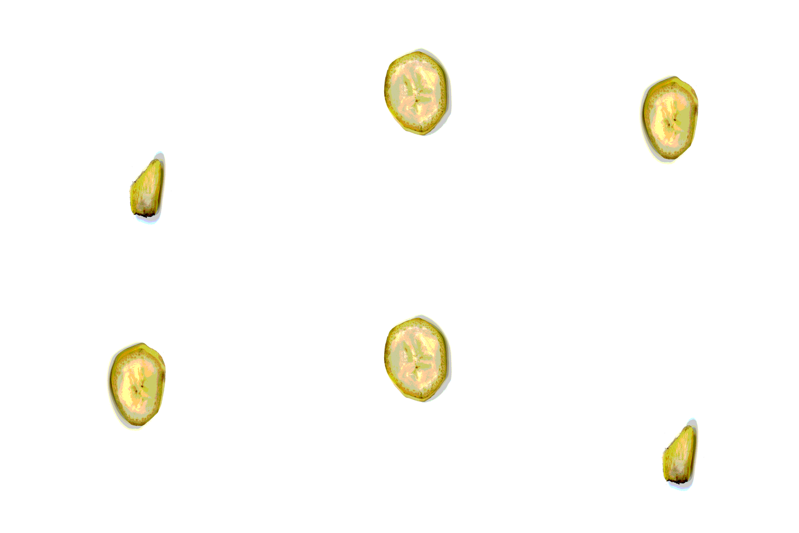
As they were cut into 5mm segments, the fruits/veggies each became 3 times its height when separated and stacked. I loved the ridiculousness of it.
I then realised that from the one banana, I could make 2 or 3 smaller ones simply by dividing the layers evenly. Above is one banana turned into two; every second dish separated.
The next experiment was removing the banana from its peel on each layer, resulting in one banana-flesh and one empty peel retaining its shape.
Then I tried stacking them all on top of each other. They were deliberately chosen for their colours - thinking here about 'traffic light' food labelling.
Labels:
geneticmodification,
health,
horticulture,
interdisciplinary,
outcomes,
science,
sculpture,
wip,
work
Friday, July 24, 2015
WIP: Mouse and rat traps continued
continued from this post
"The next tests will...
-use sealed timber and less ink retarder with longer drying time; see if this prevents any of the ink from rubbing off.
-use spray varnish over the print + see if this makes any difference in retaining the detail"
I tried these; then decided that it is not worth the 'shiny' surface as the resultant darkening of the wood grain makes it look less like the original rodent traps.
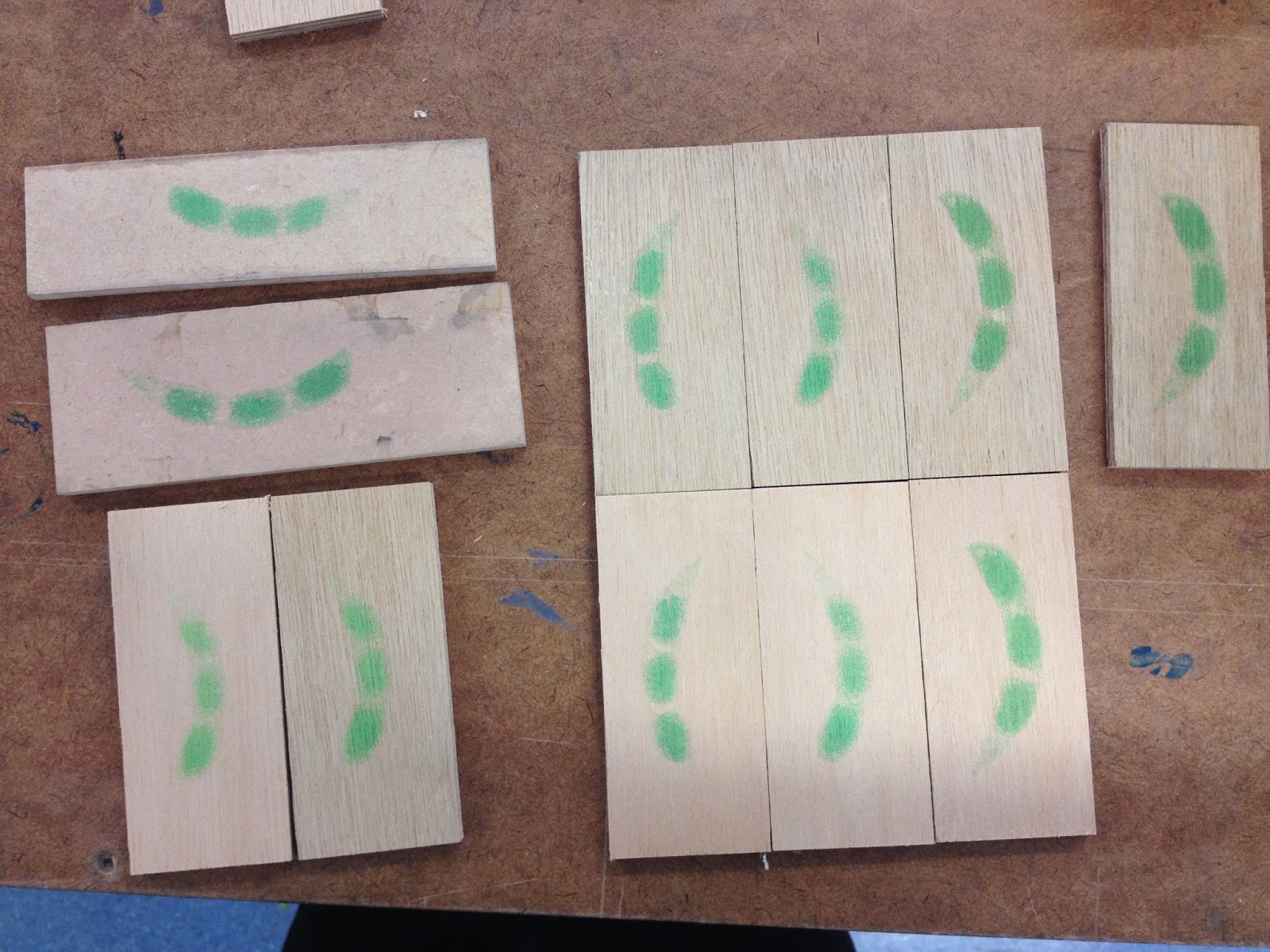
"-use green ink instead of red. I'm interested in the implications of the colour green (Green = go. Green = eco friendly, healthy, etc. Green = toxic.) and of course it is the natural colour of edamame beans. I imagine the resulting effect/message will be 'here is an inviting, seemingly healthy snack; but it's a trap.'"
Some green tests…
The first shade of green was representative of the slightly dark / earthier shade of edamame beans.
Struan suggested I use a more fluro / toxic shade of green to get this message across.
Re-shaping and sharpening all the staples (such a process):
And then trying to decide which colours to present:
"The next tests will...
-use sealed timber and less ink retarder with longer drying time; see if this prevents any of the ink from rubbing off.
-use spray varnish over the print + see if this makes any difference in retaining the detail"
Comparing spray varnish to raw timber.
Left: spray varnish test. Right: GAC varnish (on top of ink.)
Left: GAC varnish underneath. Right: spray varnish on top.
Difference in surfaces - compared to original trap
Testing different inks and colours on raw timber. Top left is Aquaprint ink, bottom left is live to print (eco-friendly) ink - magenta; right x3 are live to print magenta+yellow (red mix)
The first shade of green was representative of the slightly dark / earthier shade of edamame beans.
Struan suggested I use a more fluro / toxic shade of green to get this message across.
Re-shaping and sharpening all the staples (such a process):
While hammering the pieces together, and trying to make sure the contraption worked, I ended up trapping my fingers by accident. God it hurt. But I was really happy that it worked!
For the 'Food?' show, I displayed the red ones. The logic was that conventional red made them invisible. You have to look twice…
The works on subtle display in the corners of Projectspace:
All four traps (one corn, 3 edamame) were set + activated, and a small note warned visitors not to touch them. Luckily no one did. Knowing they are activated is an important part of the work for me - this gives them a tension. They're almost invisible, but dangerous. Or perhaps just cheeky.
Labels:
animalwelfare,
geneticmodification,
interdisciplinary,
printmaking,
research,
science,
sculpture,
wip
Tuesday, July 14, 2015
WIP: Mouse and rat traps
- Thinking about Judy's advice to print on other surfaces;
- bringing back some elements of my (successful?) earlier work 'decisions' (re-imagining familiar objects, analogies, printing on wood);
- thinking about rodents / animals for testing / pests / genetic modification / ethics, I thought about looking at mouse traps
- I bought some traps and cut up some wood in a similar size/grain to the original base
Mouse and rat traps conventionally have a logo or image printed on the platform; usually red.
I think the form and size of the corn resembles that of a large rodent… it also sort of looks like an imprint, a blood stain.
Screen printing on wood:
Above: the first wood tests were sized to fit the entire image, although this looked a bit nonsensical with the wire contraption on it. Below: the wood and image cropped to the standard trap size.
A comparison:

Conventionally, these wooden traps are also varnished - I imagine this is so that any blood can be easily cleaned off. Initially I tried applying a layer of GAC 100 and self-levelling clear gel over the print. Unfortunately some of the detail/clarity was lost as a result, presumably be because it darkens the wood grain in between the halftone dots. Still trying to resolve this. The middle print below is varnished in this way, showing the difference:
I tried removing the wire and staples from a trap and re-using them on one of the printed blocks, as I couldn't find any staples of a similar size/colour in any of my local hardware stores. Unfortunately the staples buckled a lot when hammered back into the wood, and it is a challenge to get them positioned just right. In any case it pretty much worked, and here's the slightly wonky result of the first test:
I also had some smaller mouse traps to experiment with. Corn and soy are two of the most genetically modified crops in the world, so for these I used my x rays of edamame beans.
The importance of using ink retarder, illustrated:
Below: the middle one is printed directly on raw timber. For the print on the right, I used the GAC/gel medium underneath the print. This was great, until...
…I went to add the metal parts the next day, and it began rubbing off.
So now, for each staple, I need to re-shape the metal (which bends out of shape when extracted,) flatten it, and file both ends into sharp points before hammering into the new wood. Such a process - hopefully will be worth it.
The next tests will...
-use sealed timber and less ink retarder with longer drying time; see if this prevents any of the ink from rubbing off.
-use spray varnish over the print + see if this makes any difference in retaining the detail
-use green ink instead of red. I'm interested in the implications of the colour green (Green = go. Green = eco friendly, healthy, etc. Green = toxic.) and of course it is the natural colour of edamame beans. I imagine the resulting effect/message will be 'here is an inviting, seemingly healthy snack; but it's a trap.'
Labels:
animalwelfare,
geneticmodification,
interdisciplinary,
printmaking,
research,
science,
sculpture,
wip
Wednesday, July 8, 2015
Documentation, weeks 15-18: Notes for 'Have you ever...'
My ongoing interest in the Seralini Affair.
Work in progress…
The original rat images
The first sketch
The finished outcome
Some of the ideas going on:
Watercolour illustrations = associated with stories for children. I think that anthropomorphic animals in stories send mixed messages to children from a young age, implying some confusing double standards about animal welfare.
The title of this painting connects it to the nursery rhyme: 'Have you ever seen such a thing in your life... as three blind mice', as well as referencing the importance of scepticism towards scientific studies. Have you ever seen such a thing in your life? Really? Have you ever developed a giant tumour from eating popcorn? Know anyone who has? Could people really get cancer from eating GM corn? (Also, perhaps, blindness = metaphor for consumer helplessness, guinea pigs subject to corporate interests, unable to know what we're really consuming, as Seralini puts it 'eating in the dark'.) It touches on the circulation of misinformation regarding health science.
Monsanto's GM corn was not properly tested before being grown for commercial use. The lab rats in their experiments were only observed for 3 months, and even in that time there were some dubious results. They were, however, awfully quick to shoot down Seralini's research, even though the duration of his study was 8 times longer than theirs. The product went straight to market without proper testing. It's as if people - consumers - are the guinea pigs.
The thing that interested me the most about the Seralini affair was my observation that these lab rats, that had been fed GM corn (and RoundUp) and developed giant tumours, actually end up looking a bit like popcorn themselves. They've 'popped' just like the GM corn they are fed. You are what you eat??
The rats are life-sized, surrounded by larger-than-life size popcorn kernels - in this way size itself is also reference to genetic modification (and the idea of making things bigger.) As if the rats themselves are just pieces of popcorn.
Popcorn is a symbol for multiplicity; with that in mind, rats and other rodents are pests that breed and spread like the plague, spreading disease. It makes a connection that I see as fundamentally important part of my project: finding similarities between GMOs and introduced pests. And making the point that they don't belong in NZ.
It's also partially inspired by my part-time job at a cinema, which involves cleaning up a LOT of popcorn all the time. No one would ever eat this popcorn - it looks like it's in the bin (where else would you find rats?) so it references the problem of food waste. As well as the holocaust-esque disposal of sentient beings that is animal testing itself.
Why watercolours?
I've been trying to use watercolours for subjects that are appropriate to its unique traits - e.g. its 'lightness' is ideal for popcorn; 'fluffy' edges are the perfect technique for animals fur. I'm a painter so I appreciate the bleeding of paint across wet paper to create seamless tonal gradients without blending. And that, however deliberate a mark, there is an element of unpredictability, and seeing how pigments react with each other and dry often feels like a science experiment - which is, again, relevant to the subject here.
I wanted to make a watercolour painting that doesn't just float in the middle of the page. Hence a field of popcorn that reaches - and reaches past - the edges of the frame. It could be on the ground, could be a wallpaper, but either way it implies a wider extended pattern, a wider problem. Lots of them.
Work in progress…
The original rat images
The first sketch
The paper that I initially began using (above) was printmaking paper, not watercolour paper. So the colours wouldn't lift back off the page when water was re-applied. When I realised this I had to start again. (You can see the brush strokes are sketchy - I was trying to paint the colours separately in flicks of fur, that I thought would blur together when washed over with water afterwards. Didn't happen.)
Round two:
Some of the ideas going on:
Watercolour illustrations = associated with stories for children. I think that anthropomorphic animals in stories send mixed messages to children from a young age, implying some confusing double standards about animal welfare.
The title of this painting connects it to the nursery rhyme: 'Have you ever seen such a thing in your life... as three blind mice', as well as referencing the importance of scepticism towards scientific studies. Have you ever seen such a thing in your life? Really? Have you ever developed a giant tumour from eating popcorn? Know anyone who has? Could people really get cancer from eating GM corn? (Also, perhaps, blindness = metaphor for consumer helplessness, guinea pigs subject to corporate interests, unable to know what we're really consuming, as Seralini puts it 'eating in the dark'.) It touches on the circulation of misinformation regarding health science.
Monsanto's GM corn was not properly tested before being grown for commercial use. The lab rats in their experiments were only observed for 3 months, and even in that time there were some dubious results. They were, however, awfully quick to shoot down Seralini's research, even though the duration of his study was 8 times longer than theirs. The product went straight to market without proper testing. It's as if people - consumers - are the guinea pigs.
The thing that interested me the most about the Seralini affair was my observation that these lab rats, that had been fed GM corn (and RoundUp) and developed giant tumours, actually end up looking a bit like popcorn themselves. They've 'popped' just like the GM corn they are fed. You are what you eat??
The rats are life-sized, surrounded by larger-than-life size popcorn kernels - in this way size itself is also reference to genetic modification (and the idea of making things bigger.) As if the rats themselves are just pieces of popcorn.
Popcorn is a symbol for multiplicity; with that in mind, rats and other rodents are pests that breed and spread like the plague, spreading disease. It makes a connection that I see as fundamentally important part of my project: finding similarities between GMOs and introduced pests. And making the point that they don't belong in NZ.
It's also partially inspired by my part-time job at a cinema, which involves cleaning up a LOT of popcorn all the time. No one would ever eat this popcorn - it looks like it's in the bin (where else would you find rats?) so it references the problem of food waste. As well as the holocaust-esque disposal of sentient beings that is animal testing itself.
Why watercolours?
I've been trying to use watercolours for subjects that are appropriate to its unique traits - e.g. its 'lightness' is ideal for popcorn; 'fluffy' edges are the perfect technique for animals fur. I'm a painter so I appreciate the bleeding of paint across wet paper to create seamless tonal gradients without blending. And that, however deliberate a mark, there is an element of unpredictability, and seeing how pigments react with each other and dry often feels like a science experiment - which is, again, relevant to the subject here.
I wanted to make a watercolour painting that doesn't just float in the middle of the page. Hence a field of popcorn that reaches - and reaches past - the edges of the frame. It could be on the ground, could be a wallpaper, but either way it implies a wider extended pattern, a wider problem. Lots of them.
Labels:
animalwelfare,
foodsystems,
geneticmodification,
illustration,
materials,
notes,
painting,
paintings,
science,
watercolours,
wip,
work
Tuesday, July 7, 2015
Documentation weeks 15-18 'The Colonel'
While painting the large-scale watercolour of popcorn, and going slightly mad in the process, I kept finding what looked like morbid faces in the shapes of the kernels. I got thinking about the implications of this - a bizarre but possibly interesting juxtaposition? - and the possibility of referencing vanities with popcorn. This idea also led me to this antiquated website: Popcornface, and I knew I had to do it.
The image below was made by combining skull-like elements from different kernels. However the result is still not as subtle as I would like it, so I might try again... but probably not. On reflection I feel like using an image of a skull oversimplifies the ideas I'm interested in. Skulls generally imply "X=inevitable death" and I'm much more interested in the complexities, complications, misinformation etc of food systems.
Documentation weeks 15-18 'Have you ever seen such a thing in your life'
Have you ever seen such a thing in your life
Watercolours on paper, 55x73cm
Notes and working images here
Labels:
animalwelfare,
geneticmodification,
health,
illustration,
outcomes,
painting,
science,
watercolours,
work
Monday, July 6, 2015
Documentation: Weeks 15-18 'Bio In Security'
Bio In Security
Watercolour on paper, 55x73cm
Notes from my application for the Henrietta and Lola Ann Tunbridge watercolour scholarship:
It's as if these x-rays were made to be translated into a watercolour painting. See also my small multi-media piece, colour-coding the layers to different paint media (watercolours, acrylic and oils)
Notes from my application for the Henrietta and Lola Ann Tunbridge watercolour scholarship:
'Delicate' and 'detailed' - not necessarily qualities which are encouraged in a contemporary art environment, but they certainly explain why watercolours are my go-to medium. ... I enjoy detailed line-work, and this is a medium that creates its own fine outlines, from pigments pooling at the edge of a painted area
My current project is primarily about food systems, and these works address topics that interest me such as the Queensland fruit fly, the Seralini affair, and the ongoing GMO debate. I have been drawing links between the materiality of food and art - e.g. gum arabic, used as the binder in watercolour paints, is also used widely in processed food.
As paper itself also essentially acts as a binder, watercolours are notoriously unforgiving (unlike acrylic and oil paint, you can't scrub a layer away and paint over it,) but this is also what makes them appear so luminous, like a digital screen. Such translucency lends itself to to the process of layering, and aligns with my interest in X-rays. It also refers to the 'transparency' of certain systems - food labelling, medical science, surveillance, biosecurity.
It's as if these x-rays were made to be translated into a watercolour painting. See also my small multi-media piece, colour-coding the layers to different paint media (watercolours, acrylic and oils)
Monday, June 22, 2015
Subscribe to:
Posts (Atom)